
Rhetorical Analysis
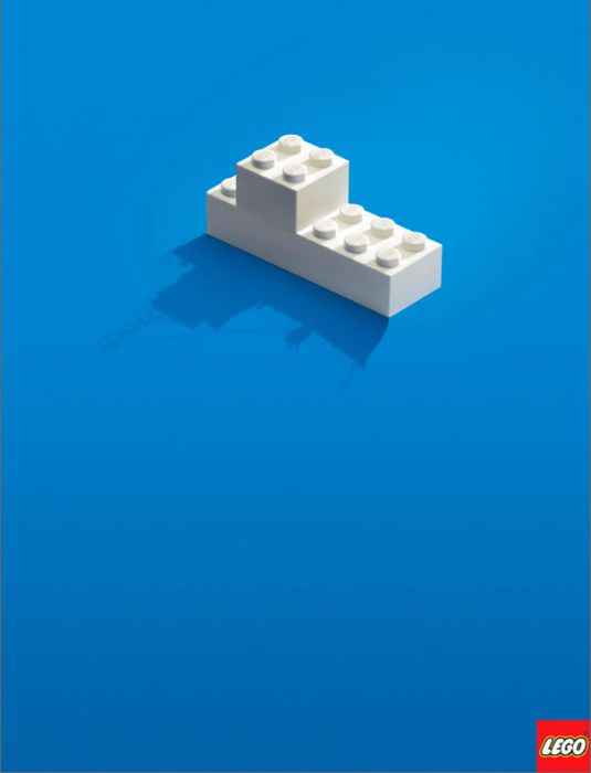
This advertisement by Lego, is not only an excellent example of effective advertising but also, adheres to the coherence principle. The image is meaningful to anybody that has ever played with Legos. It’s just two connected Lego blocks sitting on an empty blue surface, with the shadow of the blocks taking the form of a boat. The shadow symbolizes the imagination of the child that is playing with them. Better yet, the image altogether represents what Legos mean to children.
The image uses two of the rhetorical appeals, logos, and pathos. The logos appeal in the photo appeals to the consumer by reminding them of the versatility, and variety, of things that can be done with the product. The pathos appeals to the consumer by implying that Legos are to your children more than just blocks. The key messages with this advertisement are, “The possibilities are endless,” and “You are giving your children so much more when you buy them a set of Legos.”
The adherence to the coherence principle is obvious. The subject is clearly Legos, and what they give to the consumer. It is presented entirely by itself leaving no room for distraction. The image is just a little toy boat on a blue surface.
Apart from being a very effective advertisement, the image also adheres to the principles of design. The presentation and alignment are well balanced with the object just above center. There is no grouping to talk about as there is only one object in the photo, which is another characteristic of the coherence principle. The fewer the images, the fewer chances of distraction. Consistency isn’t an issue here either. Because of the one object being presented, there is no need to establish patterns, and repetitions. The contrast is excellent. The light object, with a very clear shadow, stands out really well in front of the blue gradient background.
This is a very interesting picture. None of the features in the photo are there by mistake. Everything presented serves a purpose. The gradient background gives the appearance of more content in the photo. The bright object with a darker background is very easy on the eyes and very comfortable to look at. The audience won’t have to strain to see the material. The shadow also shows up really well because the object was placed in the brighter part of the background. The picture also resembles a still life painting with the use inanimate objects. Just as interesting is the placement of the Lego logo. The lower right hand corner is typically where an artist would sign their work. Perhaps this was done to associate the credibility of an artist with the Lego brand, or to present Legos as an art form. If so, that would be an appeal to ethos.
This photo is an effective advertisement that adheres to the coherence principle. Its simplicity leaves little room for distraction and its content promotes critical thinking. Just looking at it leaves the viewer thinking about what can be done with a simple set of Legos.